-
Posts
6,530 -
Joined
-
Last visited
-
Days Won
287
Content Type
Profiles
Forums
Release Notes
Bug Tracker
Help page
Help page-CN
Release Note5
Rules and recruitment
Release Note6
Everything posted by BugSir006
-
Hi A.S. Thanks for opening this thread for discussion. And the issue you encountered is quite clear with the pics you attached there. Icons are blurred only if you change them to 24*24 or bigger pixs. And I really want to figure out why and how to solve. Then I tried two things. 1st, I went to downloaded 3 other extensions uploaded before or after the launch of MX5. They appear like this on MX5 (v5.0.4.400) and MX4 (v4.4.8.2000) oh, the third one is from you. Thanks for making extensions for MX all the time. From these two pics, I cannot say which row is clearer or blurrier than the other one. So I suppose Maxthon may not have changed the standard? But this is not enough since your picture is so clear showing. So I did another thing, to read the extension SDK file, which is quite beyond my ability as a person almost know nothing about programming. I just pick the related part to read and saw this paragraph: As far as I understand that, every creator needs to upload 3 different sized icons for the computer choose to show in the right place. So it will choose the right sized one to avoid blurring and make it fit automatically? Or machine cannot be that smart? Am I understanding it correctly? If no, please help shed some light on me, thanks in advance. These two tests still cannot solve my confusion, why the others show clear while your newly developed is blurred? You upload 3 sized icons to each extension you made, right? So with my confusion, I decide to ask this question to our technicians who knows more about extension than me this afternoon, hope he can provide more information.
-

pc issue New Spotify Web Player not working in MX5
BugSir006 replied to 7twenty's topic in Maxthon Support & Discussion
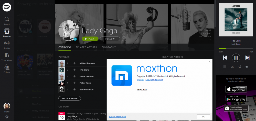
they pushed the new UA yesterday, so it may alive now, and I checked again just now, you don't have to change UA manually. (I was using portable version, but that may not matter with this issue) Does a refresh help? -

pc issue New Spotify Web Player not working in MX5
BugSir006 replied to 7twenty's topic in Maxthon Support & Discussion
Hi Rob, our technician has pushed a new UA to this site, so users should visit it's older format in version 5.0.3.4000 now. And the core reason that Maxthon doesn't support well for Spotify (Netflix, Amazon video, etc.) is that Maxthon is lack DRM plug-in, which is 6m big. Our PM decides to begin to program the plug-in for Maxthon, but will not add it to the install pack, since it will increase the size. They plan to make it cloud download when first time running Maxthon. BTW, in my test, it shows the purple pop-up every time I refresh the page, and cannot play any music. Is that the same with you? -

pc issue New Spotify Web Player not working in MX5
BugSir006 replied to 7twenty's topic in Maxthon Support & Discussion
it occurs everytime when I refresh the page. And could play music but no sound. Already forwarded to the developer to check Edit 2017-04-07 Confirmed as a bug. -

pc issue New Spotify Web Player not working in MX5
BugSir006 replied to 7twenty's topic in Maxthon Support & Discussion
seems no problem on my side? how to reproduce Is this the new Spotify web player you referred to? ah, I got it -
Thanks a lot, Wilser! Can I share the link of this thread to Maxthon's Facebook Fan page so more people could have access to these wonderful skins?
-
Let's get this thread pinned!
-
You must have read the reply from BugMiss006 already, so I'll not clarify it here again.
-
Hi Wilser, our testers have confirmed and reported this bug to programmer already. BTW, every time we run this bookmarklet, my computer will get frozen. Is it the same case on your device?
-
Thx! Very clear!
-
Confirmed now.
-
Hi Wilser, I tried the same as you but it works. So could you help me to check if I set the bookmarklet right? I copied the script you provide here:
-

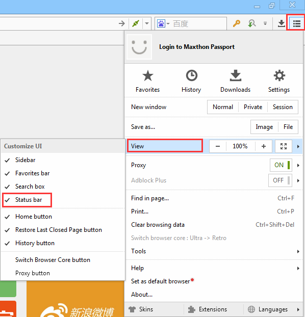
How to close lateral bar in MX5?
BugSir006 commented on Francesco Plaitano's bug in General Product Support
hi there, Maxthon browser should be able to remember your settings? Are you using guest mode? Or have you logged in a Maxthon account? -
-
Cool, and how you manage to create it?
-
BTW, please post problems concerned with MX5 here: http://forum.maxthon.com/index.php?/forum/95-mx5-discussion/
-

Cannot rate on IMDB - Maxthon 4.9.3.1000
BugSir006 commented on Perplexer's bug in General Product Support
Hi there, sorry to get you back so late. We indeed confirmed this issue, and it's related to the core version. Bad news is that we currently do not have any plan to upgrade core for MX4. Good news is that the "rate" function can be used in MX5. So we recommend you to use Maxthon5. And I'll also continue collect user's voice on the core for MX4, if the amount reach to a certain number, that will be more persuasive for our product manager to change their plan. And put upgrading core on MX4 on their to do list. Thank you again and sorry for the trouble. -
Hi Ivanjo, Thanks for the suggestion. Our developers and designers are working on a more customizable skin center now. The requests you asked above like add your own picture, change the icon shapes, more default backgrounds, will all be released in future.
-

resolved Why is the extension review process so slow?
BugSir006 replied to FB Purity's topic in Extensions
Hi all, our extension center staff will check the updated and new add-ons applications every three days! -
Thank you all for walking along with us through Alpha and Beta version of MX5 Cloud Browser. Lots of meaningful feedback and suggestions are collected and accepted. Here are the records of changes we made and bugs we fixed. MX5 is becoming better and better because of our efforts. We really appreciated your share and care:P Cheers!
-
Hi both, sorry that I don't understand the issue you are talking about. What tutorial and where is it? Is there a link for me to have a try?
-

resolved Why is the extension review process so slow?
BugSir006 replied to FB Purity's topic in Extensions
Hi there, we just scheduled the meeting this Thursday, will let you know the result! -
When you encounter a crash, if it can be reproduced by some specific steps: Then, It is highly appreciated that if you can tell us : the specific steps that cause the crash; The browser version you are using; provide us the crash data Ps: Two methods to get your crash data: You can press "Win + R" keyboard > run "%temp%" and press "Enter" > find the folder "MaxthonCrashData" > compress the folder and send it to us. You can also find it directly from the following path: C:\Users\#Your User ID#\AppData\Local\Temp\MaxthonCrashData. The whole complete MaxthonCrashDate folder will be highly appreciated instead of only certain .txt document in it.
-
Hi there, may I ask which version of Maxthon are you using? installed or portable version?


