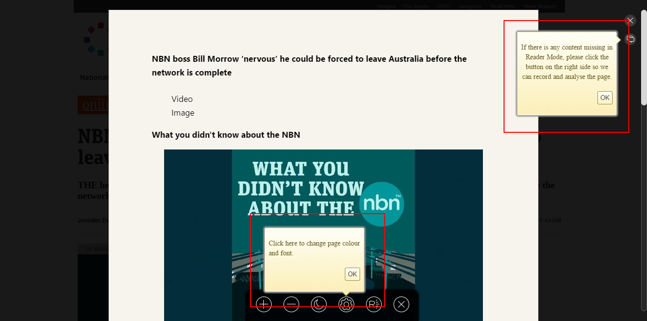
I think I may have mentioned this ages ago... and it's still not fixed.
Can someone please fix this in reader mode! Looks completely out of place compared to some of the UI design shown on first use - see the Maxnote icon info bubble below. The reader mode ones should follow the same design.

