Search the Community
Showing results for tags 'winpc issue'.
-
After about 1 year I return to MX to see if it is some improvements and indeed there are: no more troubles with videos playing or unexpected autorefreshing and generally browsing is smoothly and fast. But I'm wonder why that basic(in my opinion) options had complete disappeared: focusing on a new open tab (like in Firefox for example-„When I open a link in a new tab, switch to it immediately”-). This option exists in earlier versions of MX4(Ctrl+click) but best would be if you could do with the right-click menu from mouse. Also I don’t know why it’s so hard to implement other basic option: the complete session restore (with more than one window). Other basic option such as when restoring session to load only active tab not all tabs . This is very useful for not useless charging RAM memory, because generally you don not need instantly for all restored tabs. Why it’s so hard to implement this basic options, that other browsers have much for a long time? On the other hand, now I run MX 5.0.2.900 –portable version..wich start every time in a strange mode like when i run an installing patch (see atached pictures). And I see that is a new version 5.0.2.1000 but the browser has no option to update..(chek for updates).What should I do in this case?
-
winpc issue Default browser for Portable version
Orlith posted a topic in Maxthon Support & Discussion
Hi I'm using the latest portable version on different computer. Maxthon keeps asking / requesting rights to do change at startup in order to be the default browser, even if I unchecked the "Keep Maxthon as default bbtowser". Any way to disable that check ? I don't want it to be default browser and I would like it to stop asking for. In my opinion it's not a good choice using a portable version of an application as default oepning program for anything. Thanks -
So I've been trying a few extensions and noticed that the address bar gets filled pretty quick with icons. In fact, just using all the built-in ones (Adblock, Resource sniffer, Developer tools etc') already takes alot of space. Is it possible to control the amount of icons shown? Maybe add a show/hide option in the extension manager? Or group them up somehow? Also, when clocking "remove" on the icon of addons/extensions it says "You can hide the button of this extension in Customize UI". Well I looked for it, don't know where that is... I can only find the extension manager and enable/disable them...
-
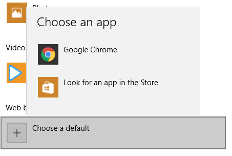
I am using Windows 10 and I found Maxthon 5 simply does not appear in my system's browser list as you can see below: And as a result 'Set as default browser' button in the menu is not working - after clicking it and choosing to allow the browser to make changes to the device, the system's default web browser becomes empty. I have tried reinstall Maxthon 5 but it's still not showing up in the list. And since the default browser function is not working I have to turn off the 'Keep Maxthon as the default browser' setting to avoid that annoying user account control notification. Anyway thank you for your guy's work and hope this issue will be fixed soon. Regards
-

winpc issue Search Bar fell off quick access page
QIK5L posted a topic in Maxthon Support & Discussion
-
Problem in v4.9.3.1000 - .ppt files from google disk do not open in browser (1.png), but its open if I enter in my Maxthon account (2.png).
-

winpc issue Maxthon UI - Lack of design consistency
7twenty posted a topic in Archived General Discussion
So this is something that i've brought up a few times before. Consistency in Maxthon's UI is somewhat lacking. There are a number of different dialogs, and each one of them has its own differences. I haven't even included SkyNote, which is still stuck in the MX3 style. 1 (orange) / Different sized titles 2 (red) / Different sized tabs 3 (red) / Different styled tabs (greyscale flat images & text / coloured images & black text / no icons & black text) 4 (green) / Different sized buttons (and naming? Done/Close) 5 (blue) / Buttons/tabs not aligned to any elements (Resource Sniffer is good, Adblock dialog elements are all over the place) 6 (purple) / Icon on title only on ABP dialog (i'm guessing this was requested by ABP - their logo plastered everywhere possible) 7 / Windows standard chrome on Resource sniffer, but MX chrome on other dialogs. Why not drop the chrome from Sniffer? The ABP dialog might still be a work in progress, but even so the framework is there so I don't see how it's that hard to make it correct from the start. It might seem a somewhat petty thing to bring up, but the UI is what every user sees and interacts with every day, it should make sense and not make the user wonder if they've started another program because elements look different (i know i'm pushing the point there, but you see what i'm getting at). Can whoever does the UI design please spend a few hours (if that) and at least fix some of the above.
.png.e651cb5b8a8ee0526747a9b1c094abe8.png)
.png.05243017594c0cd0da1f7b0d6fa2882f.png)
.png.a4f91d5d4f538304f0d3f8abd4c881a1.png)


